Interior color trends 2026
The color trends that will define 2026 will be deeply influenced by a warm, soft, and enveloping palette. After several years dominated by cool grays and pure white, interior design is shifting towards more organic, welcoming tones connected to nature. This change responds to a growing need to create homes that convey well-being, calm, and balance, in line with movements such as emotional architecture and biophilic design. In this new chromatic landscape, greens, browns, beiges, and earth tones take center stage, accompanied by deeper colors that provide contrast, character, and sophistication.
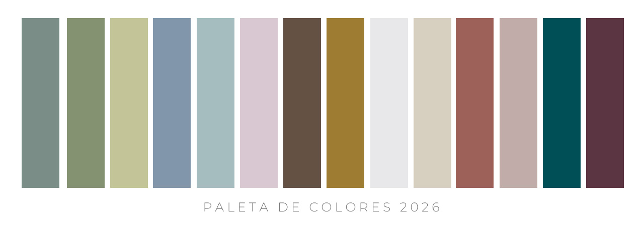
MOSS, SAGE, AND OLIVE GREEN
Nature continues to be an inexhaustible source of inspiration for interior design, and green is solidifying its position as one of the star colors of 2026. Far from the vibrant greens of previous seasons, this year muted, soft, and nuanced tones predominate, such as moss, sage, and olive. These colors convey serenity and balance, creating environments that invite rest and connection with what is essential.
Greens with blue or earthy undertones work especially well in spaces intended for relaxation, such as bedrooms or living rooms, as they provide a feeling of freshness without being cold. Furthermore, they combine naturally with materials like wood, linen, or stone, reinforcing the organic aesthetic that will be key in the coming years.
DESATURATED PASTEL TONES
Pastel tones are making a strong comeback, but in more sophisticated and contemporary versions. This year, 2026, pastel shades of gray, such as soft lavenders, dusty mints, and muted pinks, are particularly prominent. These colors bring lightness, delicacy, and a sense of calm that perfectly aligns with the desire for more tranquil and balanced homes.
Their versatility is one of their greatest appeals: they combine beautifully with natural materials like raffia, wicker, or light wood, and work equally well on walls, textiles, or small decorative accessories. Pastels allow you to brighten spaces without resorting to pure white, adding a touch of color that is both subtle and full of personality.
BROWN AND CARAMEL
Earth tones continue to gain prominence, especially among those who wish to strengthen their connection with nature within their homes. Pantone’s choice for 2025, Mocha Mousse, already anticipated this trend toward soft, chocolatey browns, capable of bringing warmth and comfort without overwhelming the space.
In 2026, we will see an even wider palette of browns, from the lightest and creamiest to the darkest and deepest. Cool undertones bring elegance and modernity, while warm ones—such as caramel, ochre, or honey—create cozy and inviting spaces. These colors work particularly well in living rooms and dining rooms, where they help create intimate and balanced environments.
WARM NEUTRALS
After years of cool neutrals dominating, warm tones are reclaiming their place. Beiges, creams, butters, and off-whites are becoming the perfect foundation for a more inviting and natural decor. Pantone’s 2026 Color of the Year, Cloud Dancer, is a prime example of this trend: a warm, soft, and luminous white that brings spaciousness, brightness, and a sense of order without feeling clinical.
Warm neutrals allow you to create versatile and timeless spaces, and they combine perfectly with the new palettes of greens, browns, and terracotta. Greige—a balanced blend of gray and beige—remains a favorite for its ability to adapt to any decorating style. Meanwhile, sandy tones evoke natural landscapes and convey calm, making them an ideal choice for bedrooms and relaxation areas.
TERRACOTTAS
Clay tones, muted terracotta, and dusty rose will be another major trend in 2026. These colors bring dynamism and a handcrafted touch that fits perfectly with the trend toward handmade and authentic items. They work especially well as accents on cushions, ceramics, rugs, or decorative pieces, as they add warmth without overwhelming the space.
DEEP BLUE, EMERALDS, AND PLUMS
As a counterpoint to soft, natural palettes, deep colors will also play a significant role this year. Petrol and navy blues, emerald greens, and plum tones bring sophistication, drama, and a strong personality. They are ideal for creating visual contrasts and highlighting specific areas of the home, such as an accent wall, a statement piece of furniture, or a special decorative item.
These intense colors work beautifully in combination with warm neutrals and earth tones, as they balance the palette and add depth. They are also perfect for those seeking a more elegant and contemporary style without sacrificing warmth.
Often, combining colors can be quite complex due to the countless shades and undertones found in decorative elements. A very useful tool for creating harmonious combinations is color theory, which encompasses both the feelings each shade can evoke in people and the basic rules for creating balanced and harmonious color palettes.