Combining colors in interior design
Colors have a direct impact on the feelings and sensations we perceive when we see them. It’s not just a matter of aesthetics, but rather how each shade influences our mood and the way we experience a space. For this reason, it’s especially interesting to mention color psychology, a discipline that studies what each hue conveys and how it can affect our well-being. If you’re thinking about painting or decorating your house, it’s a good idea to consider these associations to choose the color that best suits your needs and the atmosphere you want to create.
Warm Colors (Reds, Oranges, and Yellows)
Warm colors are vibrant, energetic, and capable of bringing life and joy to any room. They are often used in common areas such as kitchens, living rooms, or dining rooms, where the aim is to encourage interaction and a sense of dynamism. However, due to their intensity, it’s advisable to use them in moderation. Too much red or orange can be overwhelming, so they work especially well as accent colors: on a specific wall, in textiles, in paintings, or in decorative elements that add impact without saturating the space.
Cool Colors (Blues, Greens, and Lilacs)
Cool tones evoke calm, serenity, and balance. They are perfect for spaces intended for rest, such as bedrooms and bathrooms, as they help relax the mind and foster a tranquil atmosphere. They are also very suitable for study or work areas, such as offices, because they help improve concentration and reduce eye strain.
Dark Colors (Black, deep purples, navy blue, charcoal)
Dark colors add depth, elegance, and a touch of sophistication. They are widely used in work environments such as offices, where they convey professionalism and character. They work especially well on specific elements—furniture, frames, doors, or decorative details—although they can also be applied to walls if accompanied by adequate lighting that counteracts the feeling of darkness. When used well, they create modern spaces with plenty of personality.
Light Colors (Whites, off-whites, soft grays, pastels)
Light tones are the most versatile. They combine with any other color and add spaciousness, brightness, and balance. They are ideal for any corner of the home: walls, ceilings, floors, or furniture. Furthermore, they soften spaces and help to reduce the intensity when using more vibrant colors in accessories. Thanks to their neutrality, they allow you to create welcoming, clean, and visually spacious environments.
COLOR THEORY
Combining colors can be more complex than it initially appears. While many people choose their home’s color scheme based solely on personal taste, the reality is that there is a vast array of hues, undertones, and temperatures that directly influence the visual harmony of a space. Therefore, understanding color theory is essential for making sound interior design decisions. One of the most useful tools is the color wheel, which organizes colors logically and allows us to identify relationships between them. Using this framework, we can create balanced, dynamic, or contrasting palettes depending on the desired effect.
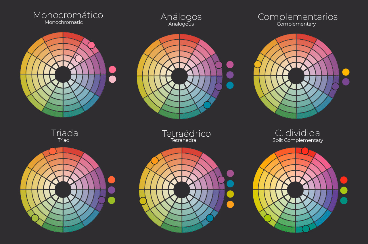
Monochromatic
A monochromatic color scheme is based on using a single color and all its possible variations: lighter and darker shades, with varying levels of saturation. This choice creates tranquil, elegant, and highly cohesive environments. It’s ideal for those seeking a minimalist or relaxing aesthetic, as it avoids visual clutter. Furthermore, it allows you to play with the intensities of the same hue to highlight specific elements without disrupting the overall harmony. For example, a living room in shades of blue can incorporate cushions or artwork in a deeper blue to add interest without losing coherence.
Analogous Colors
Analogous colors are those located next to each other on the color wheel. Combinations like blue-green or red-orange create soft, balanced, and visually pleasing spaces. This chromatic continuity conveys serenity and cohesion, making it perfect for environments where fluidity is desired. In interior design, it tends to work very well in bedrooms, living rooms, or reading areas, where harmony is key.
Complementary Colors
Complementary colors are opposite each other on the color wheel, such as blue and orange or yellow and purple. This combination creates a strong and vibrant contrast, ideal for dynamic spaces with personality. However, it requires some control: it’s important to balance saturation and brightness to avoid an overly harsh result. When applied correctly, complementary colors add energy and depth, becoming a powerful tool for highlighting specific areas or elements.
Triad
The triad uses three colors equidistant on the color wheel, forming a perfect triangle. A classic example is the combination of the primary colors: yellow, blue, and magenta. This palette is very balanced yet full of vitality, making it ideal for creative spaces, art studios, children’s rooms, or areas where the goal is to stimulate the imagination. The key is to choose a dominant color and use the other two as supporting accents to avoid overwhelming the space.
Tetrahedral
The tetrahedral combination uses two pairs of complementary colors, forming a rectangle within the color wheel. It is a palette rich in contrasts and nuances, perfect for those who want an intense and expressive decor. Due to its complexity, it is recommended to select one of the four colors as the main color and use the others in small doses, as accents or decorative details. This prevents the space from feeling overwhelming.
Split Complementary
This combination uses a main color and the two colors adjacent to its direct complement. The result is a vibrant palette, yet softer and more balanced than the traditional complementary palette. It’s an excellent choice for those seeking contrast without resorting to overly aggressive combinations. It works beautifully in living rooms, kitchens, or any space where you want to add dynamism without sacrificing harmony.
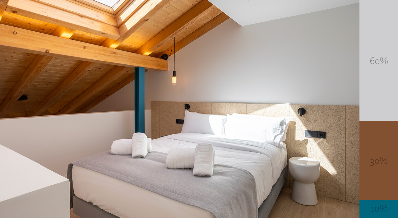
60-30-10 RULE
The 60-30-10 rule is one of the most practical and widely used guidelines in interior design. Its goal is to achieve a clear and pleasing visual balance by distributing three colors in specific proportions: 60% for the main color, 30% for the secondary color, and 10% for the accent color. These colors can be distributed freely throughout the room, on furniture, and in accessories, as long as the overall color proportions are respected.
The main color, which occupies the majority of the space, is usually applied to walls, ceilings, floors, or large pieces of furniture. Neutral tones are typically chosen because they facilitate coordination, although this is not mandatory. The secondary color, present in 30% of the space, is used in elements such as curtains, sofas, or cabinets. It should complement the main color, providing moderate contrast, and can be a different color or a darker or lighter version of the main color. Finally, the accent color—the remaining 10%—introduces personality and dynamism. It’s applied to small details like cushions, lamps, or decorative accessories, and usually involves more vibrant tones such as reds, mustards, electric blues, pinks, etc.
While this rule isn’t an exact science, it is a very useful tool for those who want to decorate without losing balance. Furthermore, it’s flexible: it can be adapted, more colors can be added, or proportions can be modified as long as a clear hierarchy is maintained.
Understanding how colors interact allows you to make more conscious decisions and create environments that convey exactly what you want: calm, energy, creativity, or balance. It’s not just about choosing pretty shades, but about understanding how they relate to each other and how they influence the perception of space. With these tools, decorating ceases to be an intuitive process and becomes a creative and strategic experience that completely transforms any home.
Be10 Tourist Apartments Project